Designing A Modern Drupal Drop-Down Menu with Glazed Theme
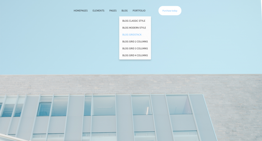
The Main Menu on your website is the first thing that catches visitor’s attention. Besides, it’s one of the most important elements that will assist the user in an effortless and intuitive navigation. In this article we are going to talk about how to design a Drupal Drop-down Menu with Glazed Theme.
Before diving into customizing our Main Menu, learn How to Create Drop-down menus with Drupal 8 and Glazed Theme.
To start customizing our menu design we need to go to the Glazed Theme Settings page. Amongst a dozen of options that are directly responsible for every element of your website design and how the end-user sees it, we are going to find the Header & Main Menu - the place that will change how our menu looks like.
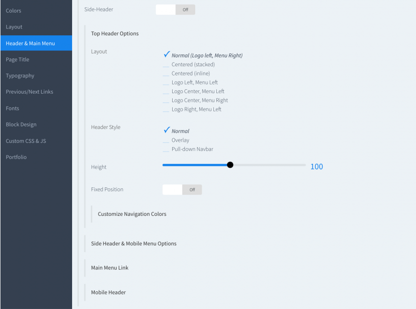
Header & Main Menu
When navigating to the Header & Main Menu, first thing that will come to our attention is the “Top Header Options”.
Clicking it will open an entire new world of possibilities. Here We can choose 1 of the 7 layouts that come pre-installed with Glazed Builder. A layout for every taste! Depending on what you want to choose for your website, you can pick between having your logo on the left and menu on the right, which is the default layout that you are already familiar with (spoiler: the one on this website), having everything beautifully aligned in the center, place the menu on the left, or several others.
Header style is probably one of the most important settings here and will determine the overall look and feel for your website (will it be more minimalistic or will it have a more “heavy” look to it?). We are able to choose between 3 general types of header styles: Normal, Overlay or Pull-down Navbar.
You can see examples of each header style and header layouts on the Glazed Theme Live Demo Page.
Each one of these options look great when implemented, but they are going to need some further refinements to look exactly how you imagined. This brings us to our next element: Height. Choosing the height value will determine how tall or short our main menu will be. Once we got our perfect Height settings we will move on to deciding whether or not we would like our Menu to have a fixed position. A fixed header stays at the top of the browser window when a user scrolls.
Behavior of the Drupal Drop-Down Menu
If we decide that we want our menu to stick to the top of the browser when people scroll, then another option will pop-out asking us if we would also like a sticky header – which basically means that the menu will appear only after the user scrolls past a certain point on your page, only then will it stick to the top of his or her window. This will be determined by the scroll offset, height & background opacity values that you decide on.
Congrats! You’re past all the technical aspects of your gorgeous Menu bar. (Well not really but for now we are moving on to the fun part - choosing the colors)
Customize Navigation Colors
Here is the place where it all comes together. You can choose colors from your website’s color scheme (Custom one you made or Glazed Default) or add individual values to each settings’ custom color. In this menu we can choose the colors for every aspect of the navigation menu: text color, drop-down background, menu hover text, etc.
After we are happy with the result we can move on to adding the final touches to our menu design.
Side Header & Mobile Menu Options
In this area you can choose the layout look on mobile devices and your side header (if you choose to opt for one in the beginning). You can determine elements such as content alignment (left/center/right) and menu bar width.
The Main Menu Link is for determining the font style and hover style of our Main Menu (both website & mobile versions).
Last but not least, by going to Mobile Header menu we will determine the mobile breakpoint and the height of our menu in order to make it even more mobile-friendly.
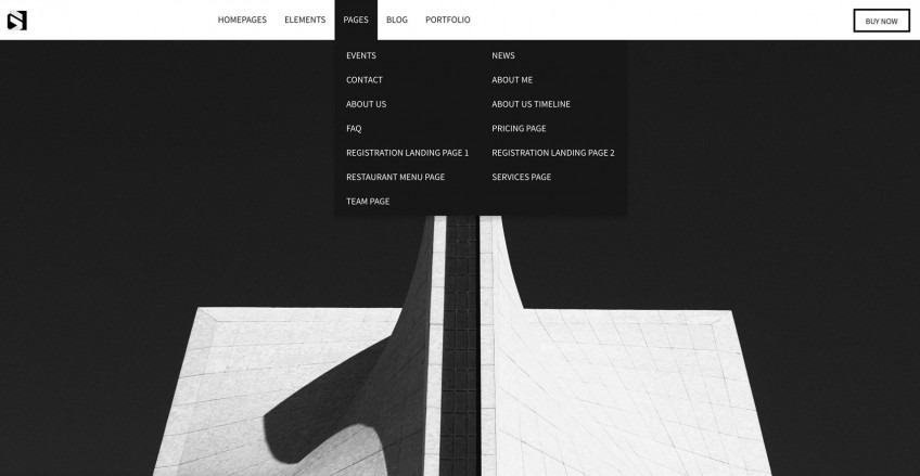
We have designed a brand new Main Menu for our website which will be enjoyed by the visitors and help them easily navigate to the information they are looking for!
We also created some Main Menu designs along with you so you don’t get bored doing it all by yourself. We’ll leave each settings value below. If you like any of them feel free to recreate or use them as an inspiration for your future eye-catching Main Menu.
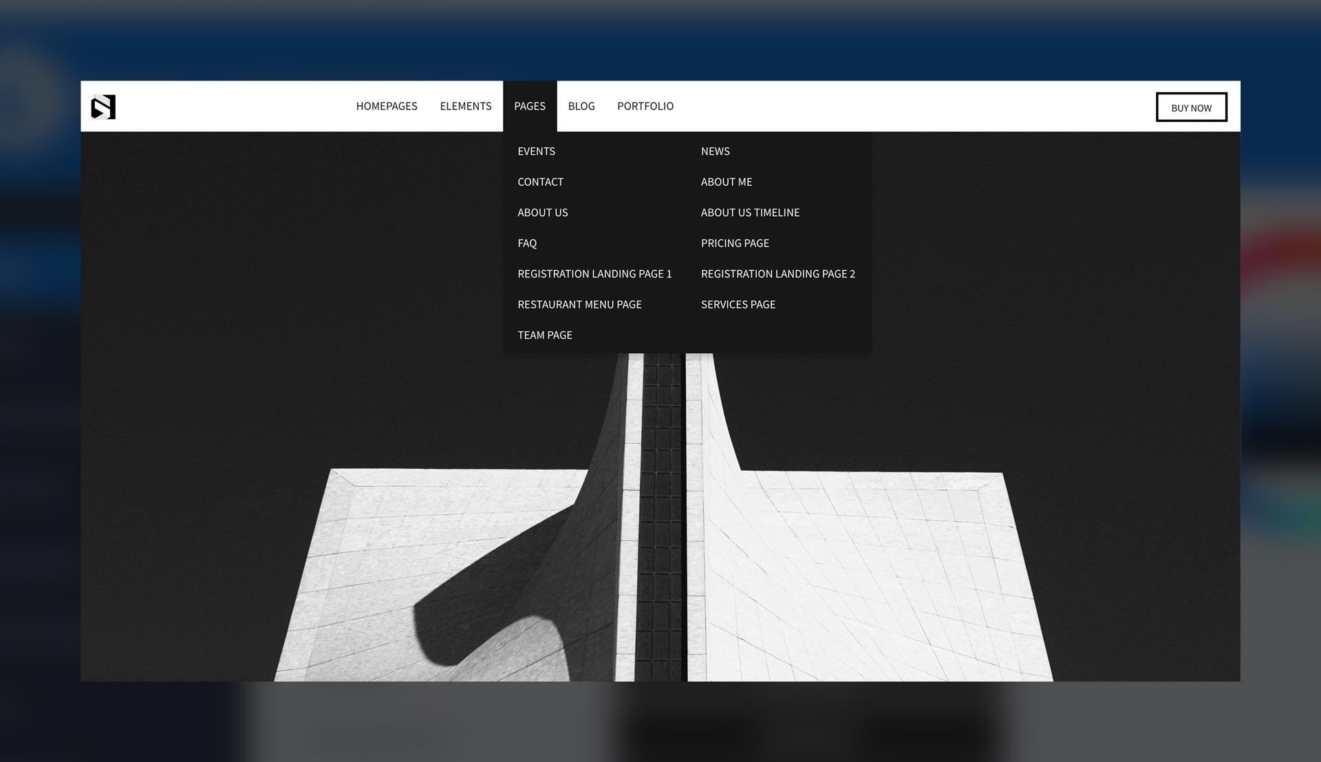
DESIGN 1
Top Header Options
- Layout: Logo Left, Menu Left
- Header Style: Normal
- Height: 70
- Fixed position: OFF
Customize Navigation Colors
- Menu Background: White
- Menu Text: Custom color - #21252a
- Menu Hover Background: Custom color - #21252a
- Menu Hover Text: White
- Drop-down Background: Custom color - #21252a
- Drop-down Text: White
- Drop-down Hover Background: #111111
- Drop-down Hover Text: White
DESIGN 2
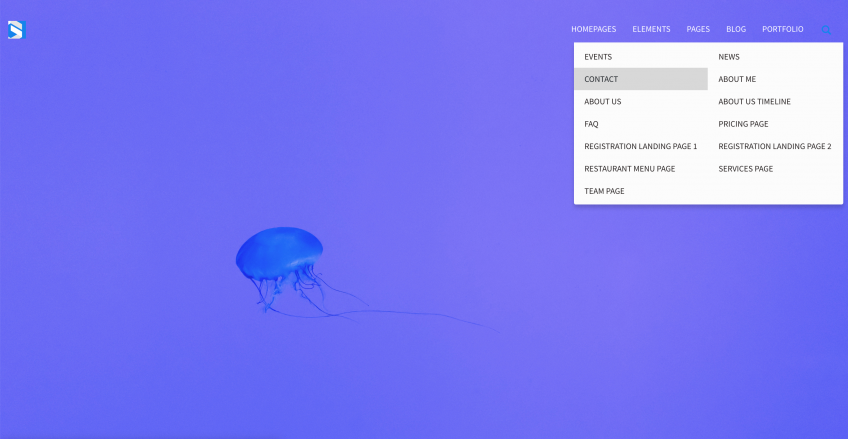
Top Header Options
- Layout: Normal (Logo left - Menu right)
- Header Style: Overlay
- Header Opacity: 0
- Height: 50
- Fixed position: OFF
- Sticky Header: OFF
Customize Navigation Colors
- Menu Background: None
- Menu Text: White
- Menu Hover Background: #ffffff00 (sets it to transparent)
- Menu Hover Text: Custom color - #b2b2b2
- Drop-down Background: Custom color - #fcfcfc
- Drop-down Text: #282323
- Drop-down Hover Background: Custom color - #d8d8d8
- Drop-down Hover Text: Custom color - #21252a
DESIGN 3
Top Header Options
- Layout: Centered (inline)
- Header style: Overlay
- Header opacity: 0
- Height: 70
- Fixed position: On
- Sticky header: On
Sticky Header Options
- Hide before scrolling: Always show
- Scroll offset: 120
- Height: 70
- Background opacity: 0
Customize Navigation Colors
- Menu background: none
- Menu text: custom color - #21252a
- Menu hover background: custom color - #ffffff00
- Menu hover text: custom color - #65b7ff
- Drop-down Background: custom color - #fcfcfc
- Drop-down text: custom color - #282323
- Drop-down Hover Background: custom color - #ffffff00
- Drop-down Hover text: custom color - #65b7ff
Did you enjoy this article? Subscribe to our Newsletter to stay up-to-date with our latest blog posts!