Designing Responsive Bootstrap 3 MultiLevel Mega Menus
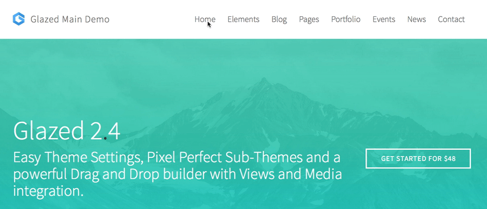
The latest new feature on our premium Glazed theme is a MultiLevel menu solution that creates smart megamenus based on simple nested lists. This means you can create a menu structure in your Drupal main-menu and the theme will generate the best layout based on your structure. No extra modules required.100% mobile friendly.
This feature marks version 2.4.4 of Glazed theme and it's the most exciting release to date. With 2.4.4 a lot of ideas for Glazed 2.4 have come to fruition, including moving the drag and drop builder out of the theme and releasing it as a standalone premium Drupal module. Now would be a great time for you to join our premium Drupal themes club or upgrade to our Unlimited Subscription!

Some experts call megamenus an outdated design pattern and I think they are partly right. If you create massive mini-sites inside your dropdowns you will not create a good experience on a small phone. The simple fact is that 5 screens-full of menu will confuse anyone who is looking for the contact page, which is typically the last link in the menu. However, mega menus can still be useful, especially on large-scale websites that provide a lot of structured content. Some of the most prominent Drupal-powered brands are using mega menus, for example Acquia.com, Whitehouse.gov, and Economist.com. While these menus work fine on a large screen, the experience on a phone is less than ideal.
Bootstrap 3 MultiLevel Menus
Bootstrap 3 does not support multilevel menus by default. However, with some simple CSS you can make your nested menu lists visible and with some jQuery you can divide your dropown in columns. I designed the desktop version of the menu to show all nested menus in a dropdown at the same time:
This effect is achieved by using some jQuery to create the columns and some CSS to show the dropdown menus.
Smart Layouts
The menu system is smart in the sense that it makes decisions about the layout based on the kind of menu structure you create in the backend. If a dropdown contains more than 7 list items, it will split the menu into even columns. If a dropdown contains 3 levels, it automatically uses the structure to create columns. If a menu contains 3 or more columns, it will automatically become a megamenu (spanning the width of the website). Here is a GIF that demonstrates all these cases in the Glazed main demo website:
Delightful Mobile Experience
Creating a near-native mobile experience based on a multilevel menu structure was a big challenge. Even in 2016, there does not seem to be a widely supported jQuery or Bootstrap extension that provides that native feel. Finally I found this gem in the codrops blog: http://tympanus.net/Blueprints/MultiLevelMenu/. Thanks to the hard work of the codrops team we now have a solution that provides meaningful animation and clear, immersive navigation to your Drupal website. The result is a mobile solution that is both elegant and clear:

It took some work to integrate it into the theme, especiall considering that the Glazed header and menu theme settings demand that the menu works in different page layouts and with varying content and menu structures. In the situation where a user chooses the top header by default, the theme will dynamically respond to changes of the browser window dimensions. This could be from a user dragging the edge of the browser, or from a user switching between portrait and landscape mode on his mobile device. When this happens Glazed theme will reflow the page and put the menu in the correct position and attach the correct behaviors. This ensures the menu is always working and always in the correct mode for the current viewport size.
Replacing TB Mega Menu
This new menu design replaces the TB MegaMenu module in all our Drupal themes. To be honest it was always a pain working with this module. even after I converted it to work with Bootstrap 3 the maintainers keep including Bootstrap 2 in the module. Even in the Drupal 8 version. Moreover the module's menu structure is not exportable, has bugs with translation, breadcrumbs, menu active trails, caching and more. Since the Glazed theme menu system works purely based on Drupal's core menu system all these problems are gone and our customers enjoy installation profiles with complete megamenu structure.
Are you interested in learning how the menu works? You can try a backend demo of our Glazed premium Drupal theme on trysooperthemes.com and see how easy it is to edit the menu. Our brand new menu system already has a documentation page too. If you are in the market for Drupal themes or our Drag and Drop site builder: you can have it all by joining the community on sooperthemes.com for just $48!