DXPR Theme has a smart menu system that automatically divides submenus in columns (top menu) or sliding panels (side menu). The theme features a mobile menu that is delightful to use thanks to meaninful animation and progressive disclosure.
This tutorial will show how to create a mega menu using just Drupal's core menu system. No extra modules are required, but you can optionally use the Special Menu Items module.
Creating a 2-level menu structure
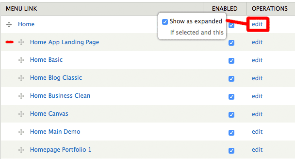
In your website, browse to admin/structure/menu/manage/main-menu. Here you can add and organize main menu links. In order to create dropdown menus, simply create the indented structure as shown below. Next, edit the parent menu item to "Show as expanded".
This menu does not require any modules but in our subthemes we use the special menu items module to create parent menu items that don't link anywhere. This menu works by entering <nolink> as path for a parent menu item.
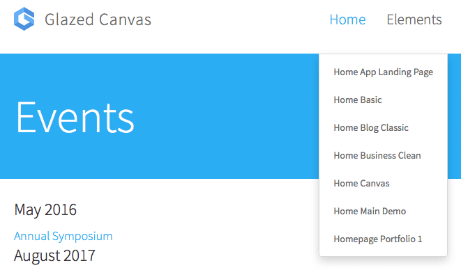
Resulting desktop menu
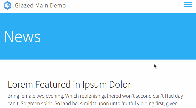
Resulting mobile menu
Creating a 3-level menu structure
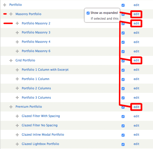
Again browse to admin/structure/menu/manage/main-menu. For 3-level menu structures simply drag menu items to create a second level of indentation, as show below, and edit all parent menu items to "Show as expanded". The menu system will display this 3-level structure as a 2-dimensional menu in the top header, and in the mobile side menu will use 3 levels of sliding panels.
Resulting desktop menu
Resulting mobile menu

Updating your website that currently uses TB Megamenu.
DXPR StarterKit releases before version 2.4.5 used TB Megamenu to create megamenu structures. This module was replaced because it was hard to maintain and had bugs relating to exporting, translation, breadcrumbs, menu trails and more. If you want your site to make use of the DXPR 2.4.4 theme menu system, simply disable the TB Megamenu block in admin/structure/block and enable the main menu in the DXPR Theme Settings Dashboard.
DXPR Menu Feature Overview
By enabling the setting "Default Side-Header" you can use the Side-Menu layout on all devices, including Desktop. With this option left disabled your site will use the top-header on large devices and the side-menu on mobile devices.
Top-Header Menu Logic
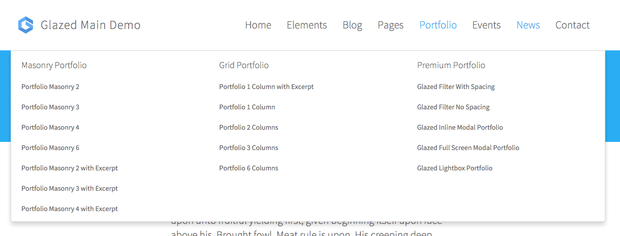
- Dropdown menus are divided in columns when there are 8 or more items
- Dropdown menus are divided into columns if 3rd level nested menus are detected. The second level menu items become column headers.
- If a dropdown menu has 3 or more columns, it will become a full-width dropdown menu (mega menu).
- At a breakpoint of 1200px the top header menu will be replaced by the side-header menu, which is optimized for smaller devices.
Side-Header Menu Logic
- The side-header processes multi-level menus by creating a sliding panel from each submenu.
- Multiple levels of nesting are supported and the menu system will provide a breadcrumb trail to inform the user where he is in the menu.
- The menu will remember it's state and breadcrumb trail after closing and re-opening.
- Breadcrumb items are clickable and function as navigation within the menu.
- At a breakpoint of 768px the side-menu will take a width of 100% to make navigation of extra small devices less cluttered.